Redesigning the Steam App
I chose the Steam app because I have been using it since high school. The app is used to see your steam profile that matches the one you have on the desktop. steam is used as a gaming library and you can share achievements while talking to friends. Since I was only exposed to only Steam at the time, I feel that I had no choice but to keep and use the app. The app, in my opinion, is ugly and over-complicated for what the app should be used for. The app never responds fast enough when I need it (receiving text), Announcements (Steam sales), or when there is an update for the software. Strange how the application on the desktop updates frequently but the mobile app stays mostly the same including not updating its design. Granted my friends and I all agree that the new updated version of Steam is less organized than the last version. The app’s overall layout is too cramped and appears to have a low resolution. There aren’t too many colors in the app, which makes it harder to navigate.
Original
Redesign
Process Book




Redesigning the Daily Horoscope App
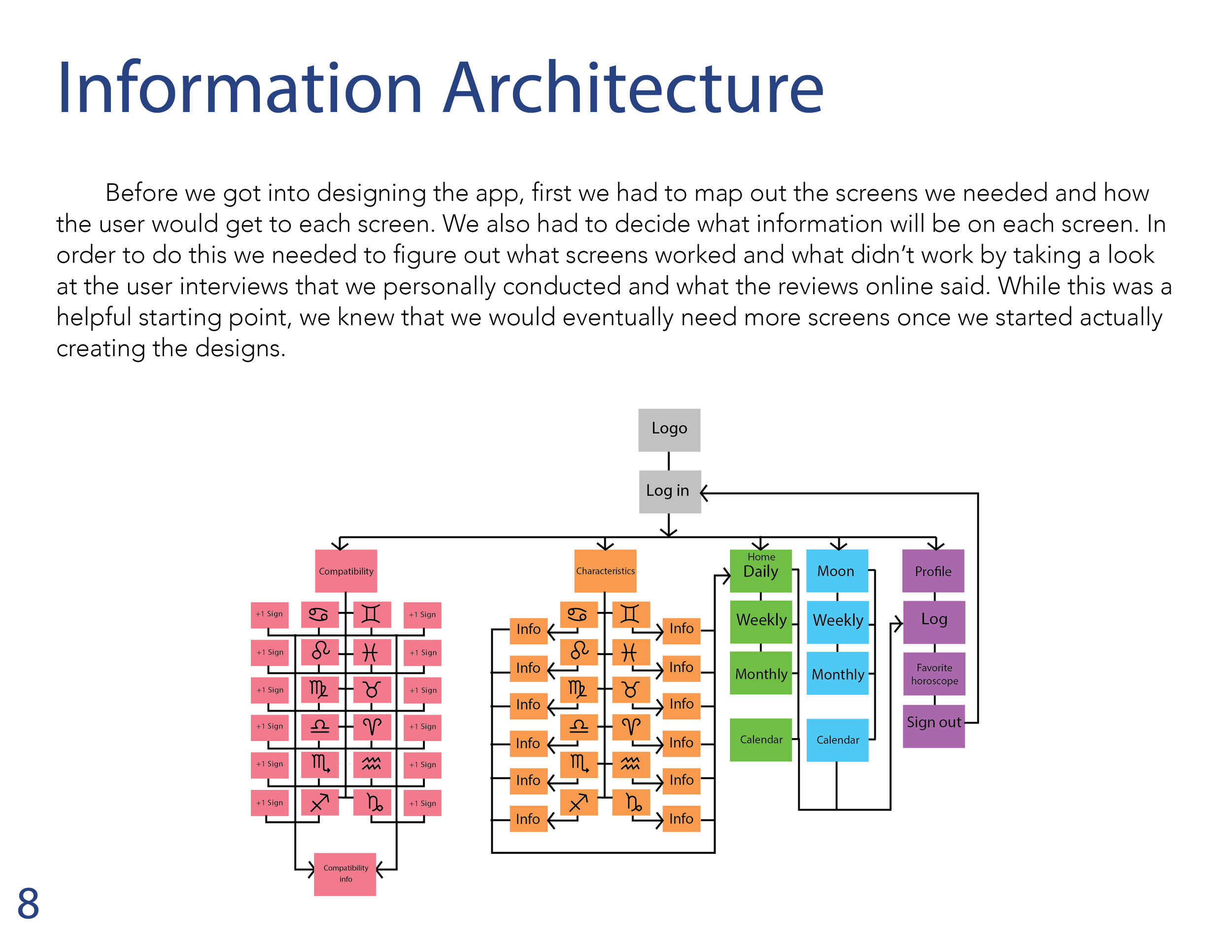
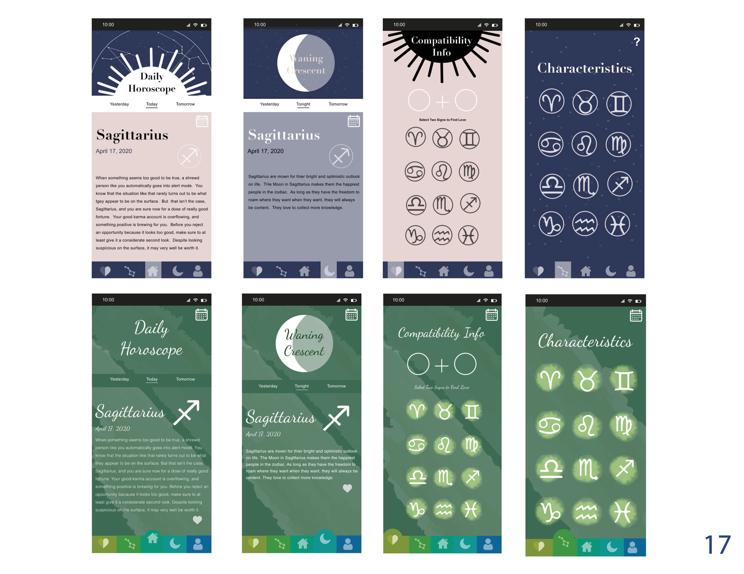
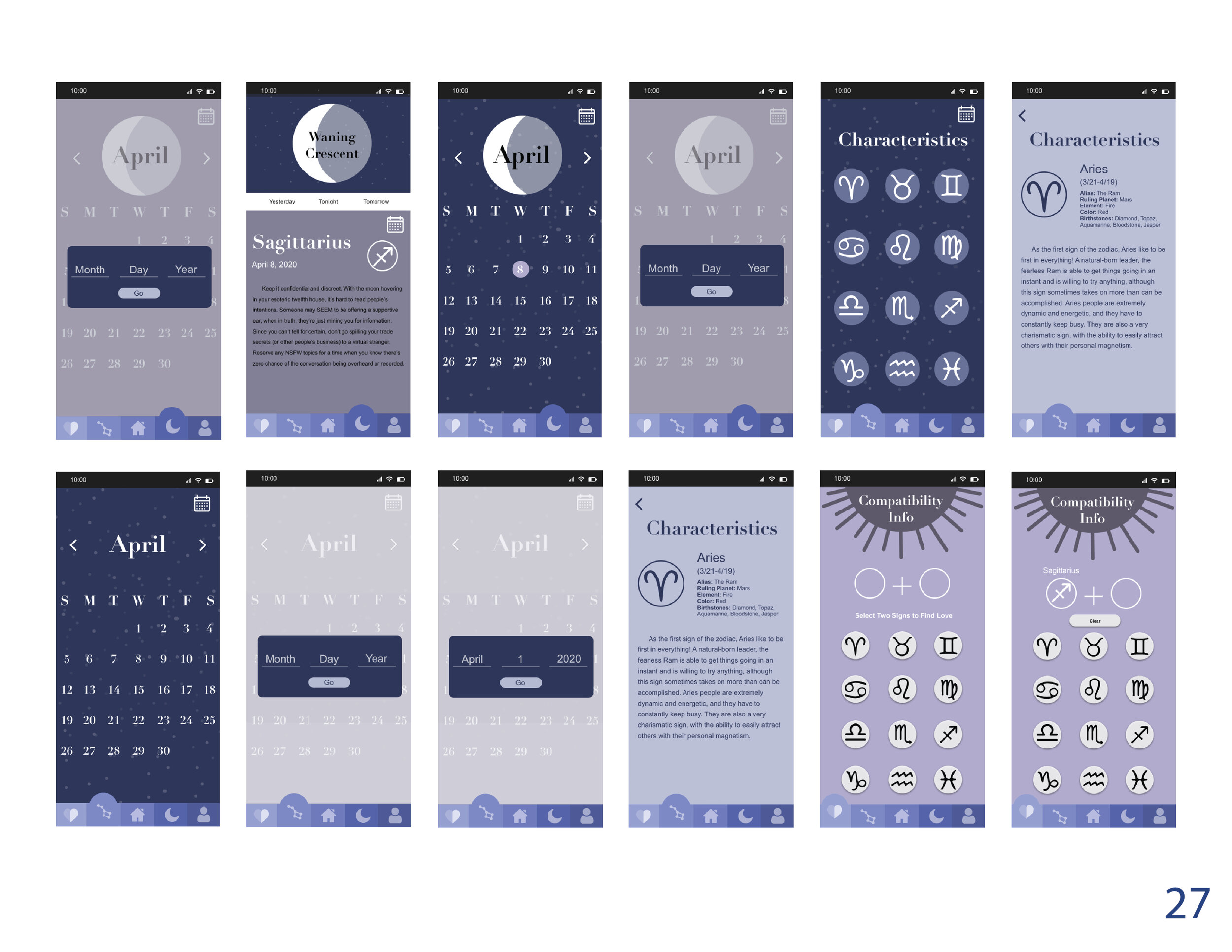
I worked to redesign the Daily Horoscope app with a partner. At first we had a hard time finding an app to redesign until we were talking about horoscopes one day and thought about how there are so many horoscope apps out there and how similar they are. Each one of the horoscope apps that we looked at for research and inspiration all had the same style and theme, the use of stars and the colors blue, purple, and green. We decided on the app Daily Horoscope, and wanted to challenge ourselves to see how we can utilize the star theme in way that hasn’t been used so much and to see how we can make it different and unique while still having it seen as a horoscope app.
Original
Redesign
Process Book


